[4 weeks]
Laundry Portal
Turned a generic monochrome booking app into an approved, brand-led dark experience across 35 screens, without losing a single working interaction.
Focus
B2C Mobile · On-demand services
Prototype
Interactive · 35 screens
Role
Product, UX & UI design — flow map to hi-fi prototype
The challenge
- Guests had to book laundry, carpet, curtain, shoe and tailoring pickups without signing up first, and sign-up couldn’t feel like a wall.
- The v1 app worked but felt generic: a neutral monochrome UI with no brand, no imagery and pill-shaped everything.
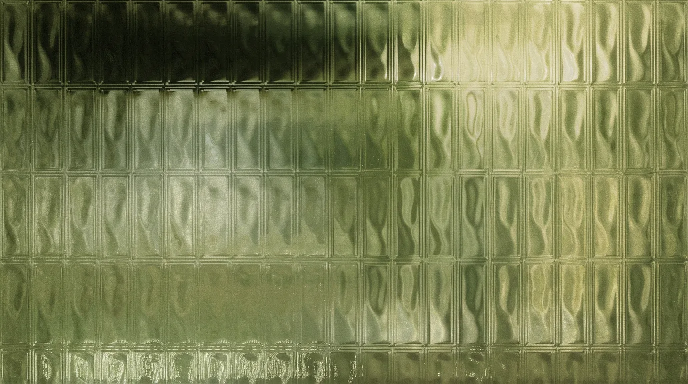
- A new brand direction (navy, linen, sky, floating-garment photography) existed only as mood boards. It had to survive dark mode and real UI.
My role
- Owned product and UX across the guest and signed-in journeys, from flow map to hi-fi interactive prototype.
- Translated the mood boards into a dark-mode Design Library: colour, type, icons, controls, cards and motion.
- Explored six home directions side by side, including light and dusk themes, and drove the review to one approved direction.
What we built
- A 35-screen prototype in six chapters: Arrive, Home, Services, Book laundry, After booking and Account.
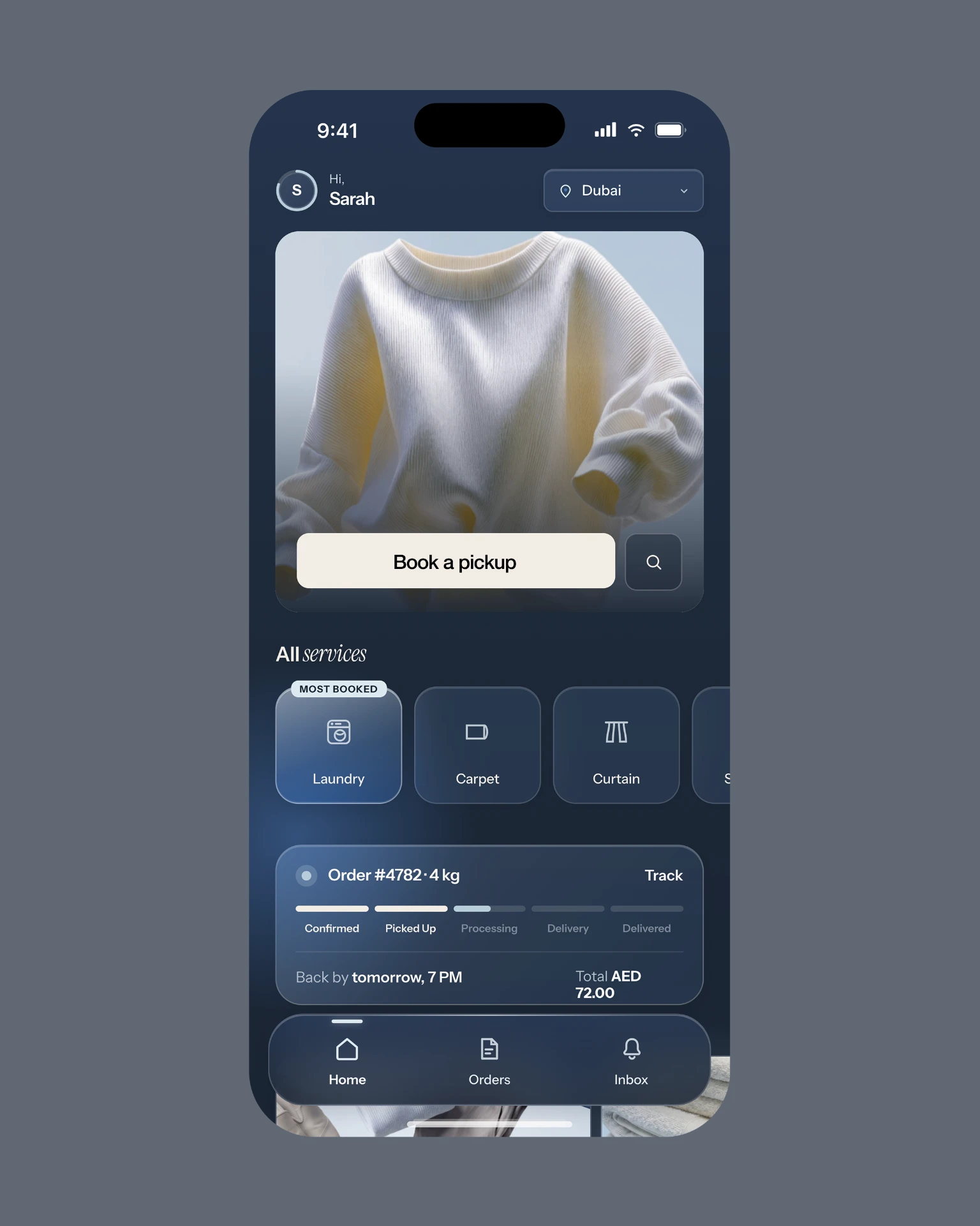
- “Dusk glass”: a navy gradient with soft blue glows, and frosted cards, sheets and navigation, applied by one set of rules everywhere.
- Guest-first booking. Prompts disappear once signed in, and sign-in is only asked for at checkout.
- Delivery speed that rewrites the date and time instantly, carpet size lines with live estimates, a pin-drop map, profile editing, and safe logout and account deletion.
- Calm motion rules (fade, settle, drift, nothing bounces), plus a logo-to-check-mark success moment.
The outcome
- The brand direction was approved and rolled out one-to-one across every screen.
- Every interaction kept working through the redesign. No functionality was lost.
- Muted text was lifted to meet WCAG AA contrast on glass, and toggles, tabs and buttons were standardised app-wide.
- Design Library v2 and a full flow map were handed over as the source of truth for the build.
Direction
Brand mood boards → a dark-mode system. Hand it over. Get it back fresh.
- Navy goes to night — Surfaces are Rinse Navy pushed darker, so every grey picks up the brand. Linen becomes the ink.
- Photos stay on sky — Brand photography keeps its day-sky backdrop, so in dark mode it becomes the one light source on screen.
- Glass, but readable — Frosted glass on cards and navigation, with denser tints under text and lifted greys for contrast.
Before
v1 · the working monochrome foundation. Welcome, Home, Vendor, Schedule and Orders — shown in the gallery above.
(Index of work)View all work →